Illustration / Packaging / Label productionA case study by Zegoe
REAL FRUIT. ORIGINAL DRAWINGS.
Small-batch spirit. Full-color character.
We translated the handcrafted character of AVITAS’s Oregon gummies into a family of illustrated tins. Real fruit, botanical detail, and a close connection to place shaped the journey from the first sketch to the final package.
Client
AVITAS / Oregon
Our role
Logo, illustration, packaging & label production
Brought to fruition
Q4 2023
THE FINISHED FAMILYRooted in Oregon.
01The brief & first direction
A handmade starting point.
AVITAS wanted its Oregon gummy line to convey an organic, small-batch feel through hand-drawn illustration, with Wyld and KIVA named as the main competitors. We began with the brand’s established turquoise, surrounding the Wild Strawberry label with illustrated fruit, leaves, and blossoms.
Early concept — Wild Strawberry in the original turquoise direction.
THE FIRST SEED
Turquoise, Wild Strawberry, and a world of botanical detail.
02Illustration & layout studies
Finding the right balance.
We explored how the botanical illustrations could work as a repeat pattern and wrap around the circular tin. Alongside those studies, we developed alternative label layouts to test the relationship between the AVITAS mark, flavor name, and product information.
FruitFoliageBotanical emblemsCombined repeat
Early label alternatives — variations in type scale and information hierarchy.
THE ILLUSTRATION WORKSHOP
Drawn by hand.
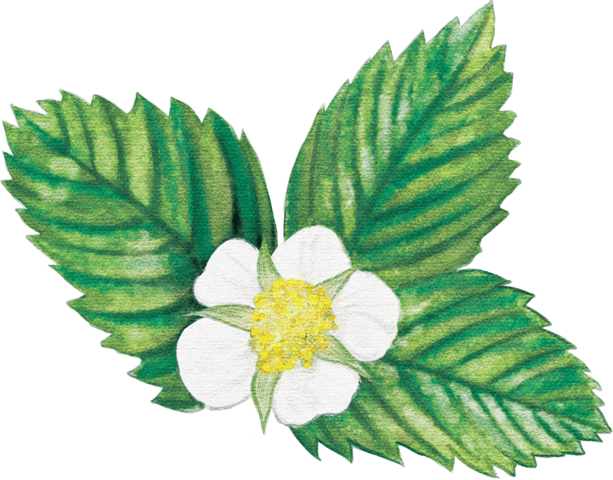
We drew each strawberry, leaf, and blossom by hand, building a library of textured botanical elements. We then combined the drawings into fuller compositions to express the real-fruit ingredients and handcrafted character of the gummies.
Whole & slicedFruit & flowerSingle fruit compositionSliced fruit composition
Developed Wild Strawberry concept.
This developed strawberry concept was set aside when the client couldn’t confirm strawberry as a launch flavor.
03The hummingbird exploration
A sense of place. A flash of turquoise.
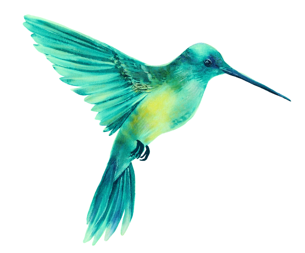
The client suggested a hummingbird to express an Oregon connection while moving the overall packaging palette away from turquoise. We hand-drew several bird studies, keeping AVITAS’s turquoise in the lead illustration, and explored how it could sit among fruit, blossoms, and cannabis foliage.
The lead illustration / AVITAS turquoise
Color study / green & blueColor study / magenta & green
✳
A little Oregon. A little AVITAS. All in one hummingbird.
A LIBRARY OF POSSIBILITIES
A broader palette of flavor.
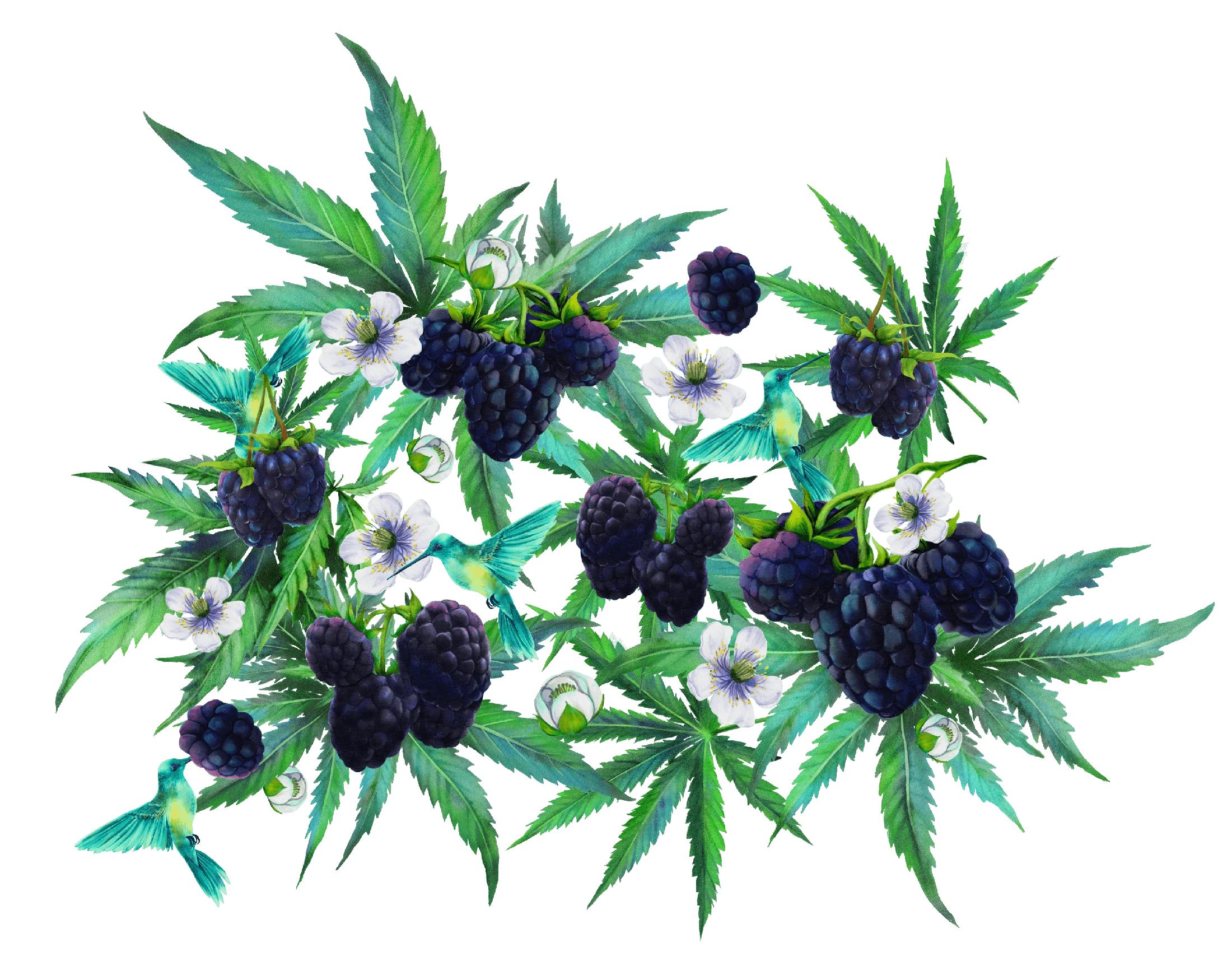
Alongside the hummingbird, we hand-drew berries, citrus, stone fruit, and cannabis foliage to explore a wider range of fruit-forward flavors. These individual studies became a flexible library of color, texture, and botanical forms for the packaging concepts.
BOTANICAL STUDIES / 19
01 / Blueberries
02 / Blackberry branch
03 / Raspberry branch
04 / Elderberries
05 / Blackberry pair
06 / Raspberry pair
07 / Blood peach
08 / Blood orange
09 / Lemon branch
10 / Lemon wheel
11 / Lemon wedge
12 / Lime wheel
13 / Lime wedge
14 / Cannabis / fan leaf
15 / Cannabis / flowering stem
16 / Cannabis / watercolor leaves
17 / Cannabis / paired leaves
18 / Cannabis / angled leaves
19 / Cannabis / layered leaves
MIDNIGHT BLACKBERRY
From drawings to a concept.
The Midnight Blackberry exploration brings the hummingbird, fruit, blossoms, and cannabis foliage into one composition. We developed the artwork into a circular label concept, testing a deeper violet palette and a diamond-shaped center panel before addressing the labeling constraints.
The packaging needed a dedicated label area for variable testing data and Oregon-required information. We integrated a horizontal band into the composition, balancing those practical needs with the illustration and brand hierarchy. The comparison shows how the label changed the available space on the tin.
STRAINTESTING DATAREQUIRED INFORMATIONONE CLEAR BAND
Concept comparison — the Midnight Blackberries tin before and after the information band is applied.
A clear information band became part of the composition.
05Refining the concept
Fruit, flower, and a sense of place.
Client feedback shaped a more fruit-forward direction with colors identifying each strain type. We paired full-color fruit with black-and-white cannabis to bring the flavor into focus. The hummingbird connects the design to Oregon’s landscape and ecosystem while carrying AVITAS’s signature turquoise.
Full-color fruit
Monochrome cannabis
AVITAS turquoise
Original hand-drawn cannabis studyBlackberry / color & monochromeCherry / color & monochromePear / color & monochrome
Indica
Midnight Blackberry
Exploring the fruit-forward direction.
Indica concept / with and without the information band
Sativa
Pear
Exploring the fruit-forward direction.
Sativa concept / with and without the information band
Hybrid
Black Cherry
Exploring the fruit-forward direction.
Hybrid concept / with and without the information band
06The final design direction
Letting the fruit lead.
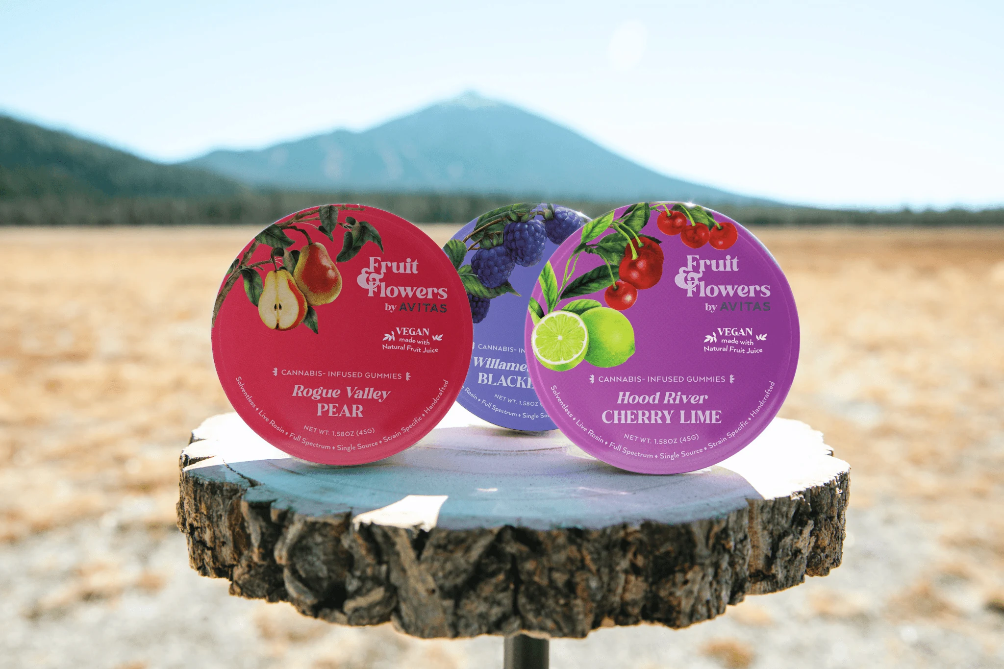
Following client feedback, we simplified the dense botanical treatment into larger fruit illustrations against open fields of color. Hood River Cherry Lime, Rogue Valley Pear, and Willamette Valley Blackberry connect the flavors to Oregon places. We presented light and dark color options across all three strains so the client and stakeholders could make their final selection. They chose the richer, darker palette shown below.
Selected tin family / Hood River Cherry Lime, Rogue Valley Pear & Willamette Valley Blackberry
07Final production · Q4 2023
From our drawing table to the Oregon landscape.
Fruit & Flowers came to fruition in Q4 2023. Across the revisions, we adapted the illustration, palette, and packaging layout to client feedback while retaining the handmade character of the original brief. The finished tins bring the family together through vivid fruit illustrations, distinct strain colors, and space for variable testing data. The lifestyle photography shows the packaging out in the Oregon landscape that inspired it.
Packaging family rendering — the final direction brought to fruition in Q4 2023.
FRUIT & FLOWERS / IN THE WORLD
Hood River Cherry Lime / by the waterRogue Valley Pear / out on the trail
Willamette Valley Blackberry / made to go along
FRUIT & FLOWERS BY AVITAS
Good things take growing.
From the first botanical study to the final tin, we shaped a packaging family around real fruit, thoughtful iteration, and a handmade sense of place.